A Love it - or Hate it Arts Hotel in Madrid
Just like polarizing public figures - you either love them or you hate them, the same kinds of feelings come to mind about this arts based, designer hotel in Spain. People either love it or they hate it, so what better to way to find out (like you ever need an excuse to go to to Spain!) than to get over to Madrid and check it out first hand.
The Hotel Silken Puerta America is based around the concept of freedom, which is articulated through the varied design styles of each feature architect, the list of which reads as a bit of a who's who of the design world: First Floor - Zaha Hadid, Second Floor- Sir Norman Foster, Third Floor- David Chipperfield, Fourth Floor - Eva Castro and Holger Kehne, Fifth Floor - Victorio and Luchino, Sixth Floor - Ron Arad, Seventh Floor - Marc Newson, Eight Floor - Kathryn Findlay, Ninth Floor - Richard Gluckman, Tenth Floor - Arata Isozaki, Eleventh - Javier Mariscal - Fernando Salas, and Twelfth - Jean Nouvel. The Public Areas - John Pawson, Restaurant - Christian Liaigre, Landscape - Harriet Bourne - Johnathan Bell, Lighting - Arnold Chan, Lighting - Jason Bruges, Garage - Teresa Sapey, Bar - Marc Newson, and Architectural Project- Felipe Saez de Gordoa. Phew!
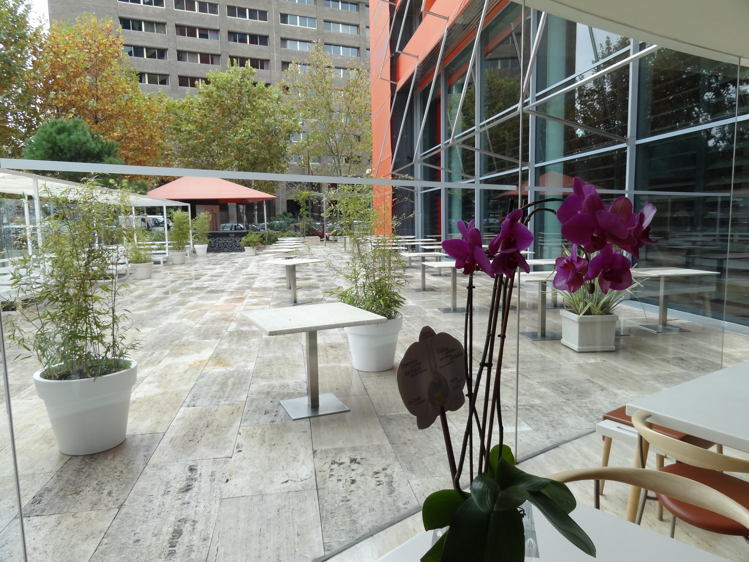
The brightly colored exterior immediately gives reference that this is not your average 5 Star Hotel, which indeed it is not - at the same time it gives no cues on what lies within. Located on a highway named Avenida de América in a part of Madrid that really doesn't have anything touristy going on, this is most definitely a destination stay, which means that you will find yourself catching cabs or the metro to other areas of the city and staying out all day as there isn't a lot to see on foot close by.
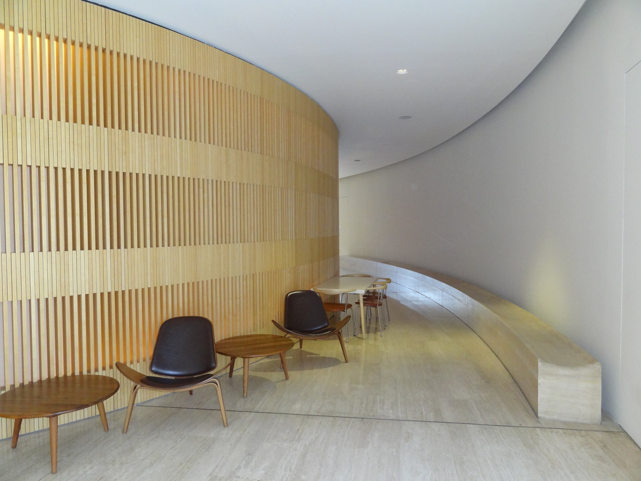
The main lobby is by John Pawson and is refined and elegant, consisting of vertical wooden slats that surround a curved reception and seating / waiting area. This starts things off nicely but again gives no clues to what lies on the other floors. The staff are relativity friendly, if not functional and don't seem to go too far out of the way to give you a hugely warm welcome or a highly personalized check in experience.
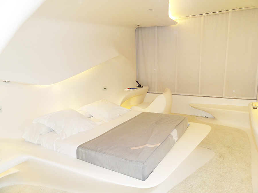
With the selection of the Zaha Hadid Suite already confirmed (hint: book in advance) the anticipation was growing to see what this highly unique experience would actually be like. Would it be as bad as sleeping in a dumpster as Moby once famously quipped? Well no. Not really but you can understand where he was coming from.
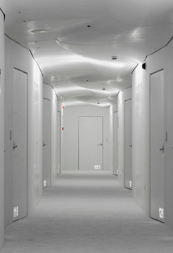
The sinuous forms of this all white room blend the ceiling to floor in a highly sculptural way, completely blurring the traditional forms of each into an almost spaceship like pod. The bed, side tables, desk and chair all blend into one continuous form, molded from hi a res plastic called Hi-Macs. With the soft lighting effects and the overall design featuring Hadid's signature swooping shapes it looks amazing but is hard to touch and evokes the same kind of 'cold' feeling as a laboratory. The bed itself is comfortable and the room well appointed with touch controls and a large curved sliding door wardrobe to hide your luggage away so as not to spoil the view.
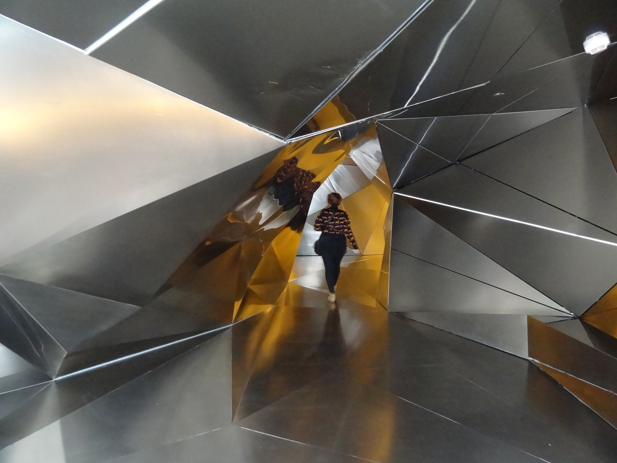
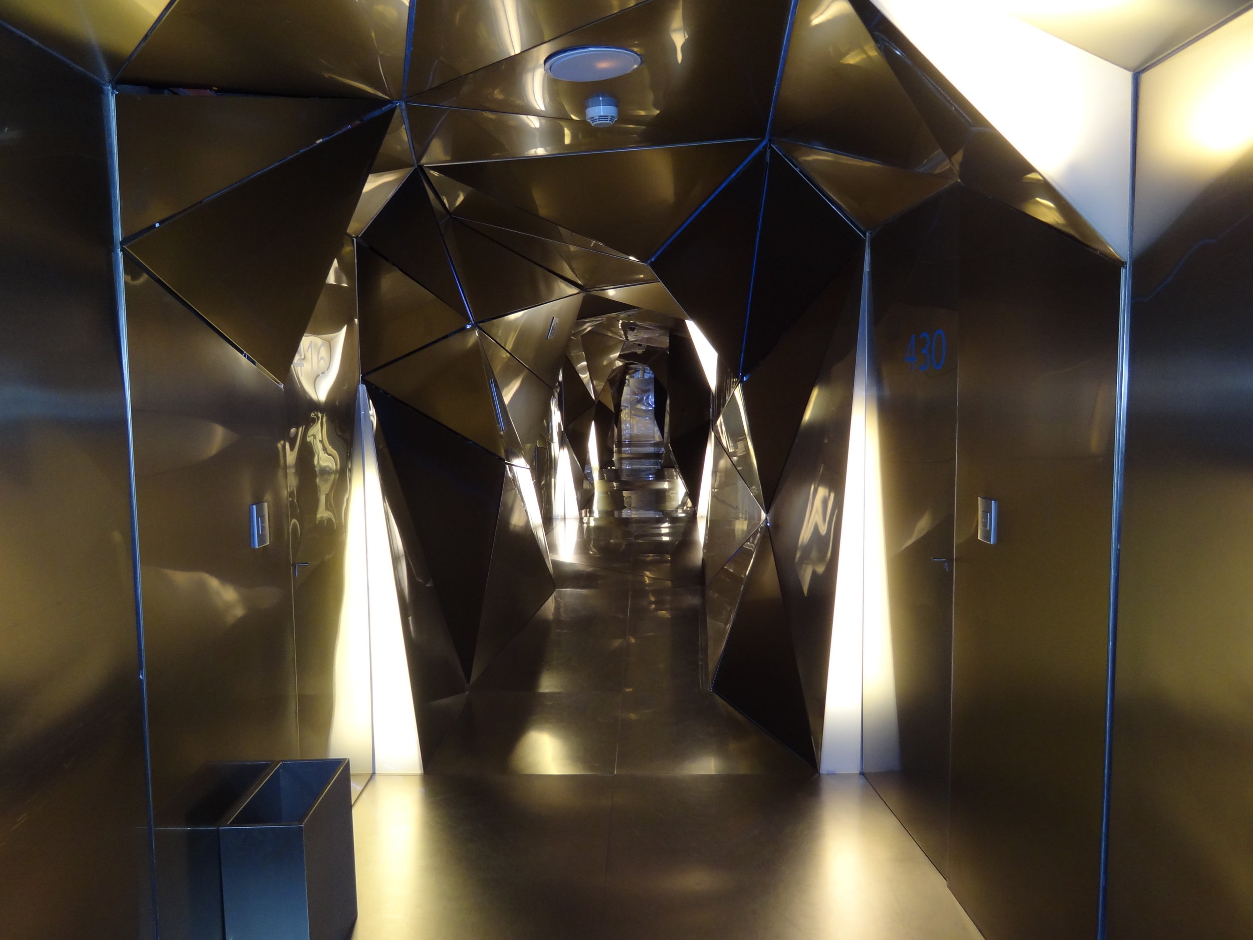
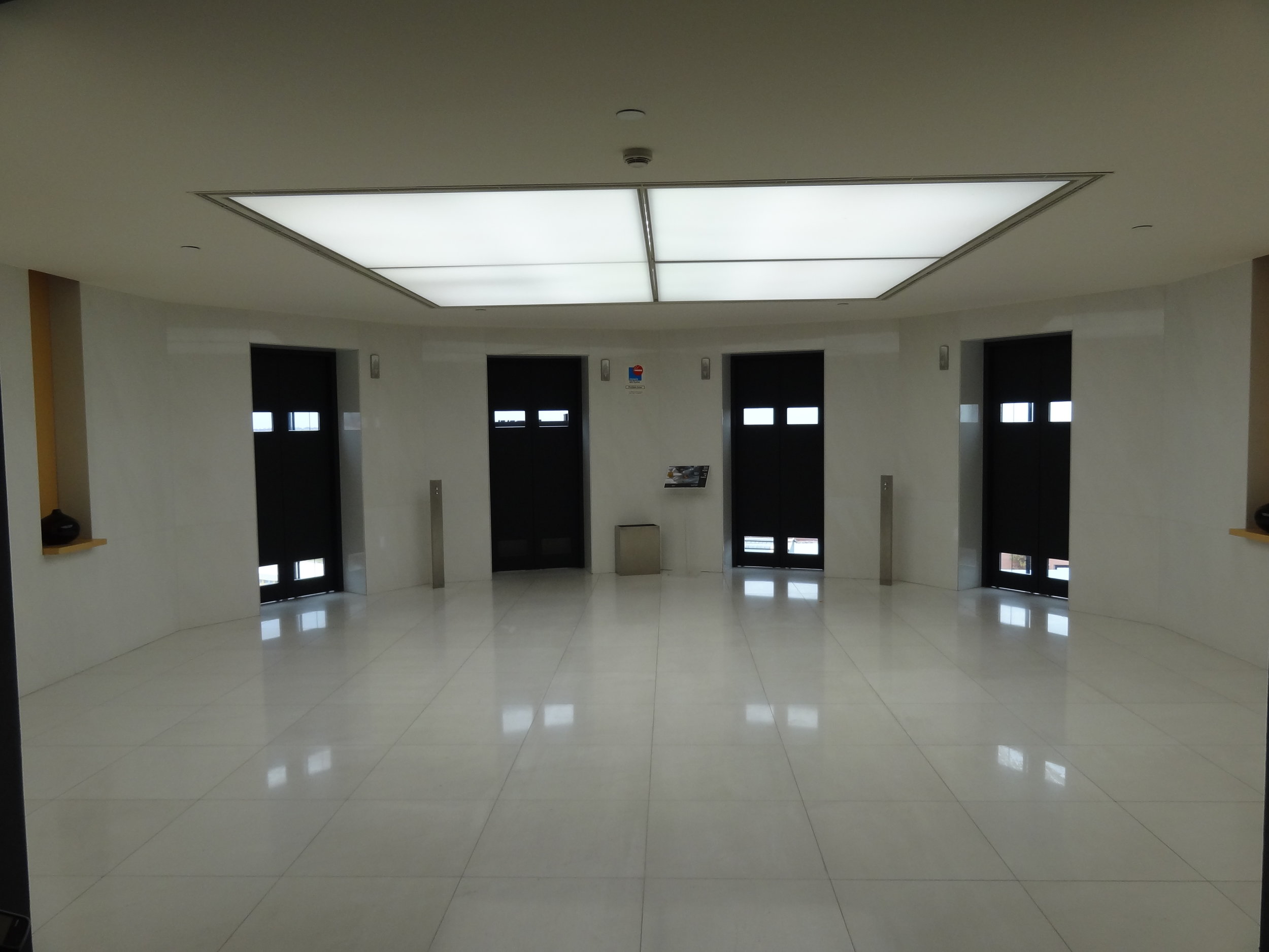
A huge part of the overall hotel experience is checking out the other floors. Each level has its own lift lobby which nicely introduces the theme for that level. Perhaps the most striking was the fractured, geometric forms on the fourth floor created by Plasma Studio.
If Zaha Hadid's level is a clean, white space pod then there's no doubt that Jean Nouvel 's lobby is the path way that leads right to Darth Vader's secret hide out when he's in Madrid. In any case it is absolutely worth spending an hour roaming around these spaces as it really is quite incredible to see.
Aside from the rooms and the lobbies, another of the main features of the Silken Puerta América is its restaurants, especially the Lágrimas Negras. Inspired by Martin Berasategui's cuisine but with its own personality, this luxury restaurant in Madrid offers diners authentic delicacies every day. On the other hand, the Mad Restaurant is the exclusive designer space where breakfast is served every day. Breakfast offers plenty of fruit, delicious grilled vegetables, eggs, meat, pastries and typical Spanish fare.
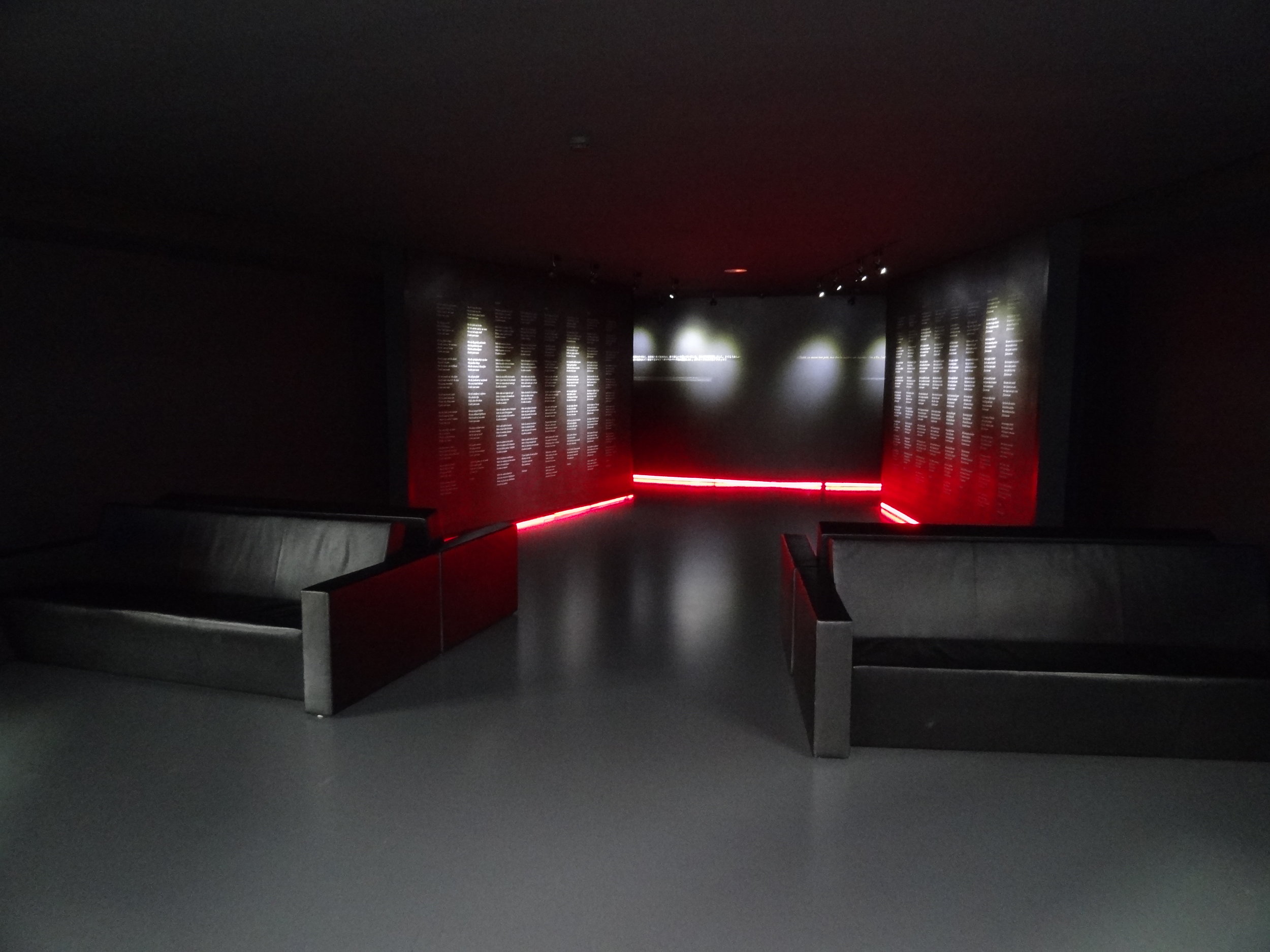
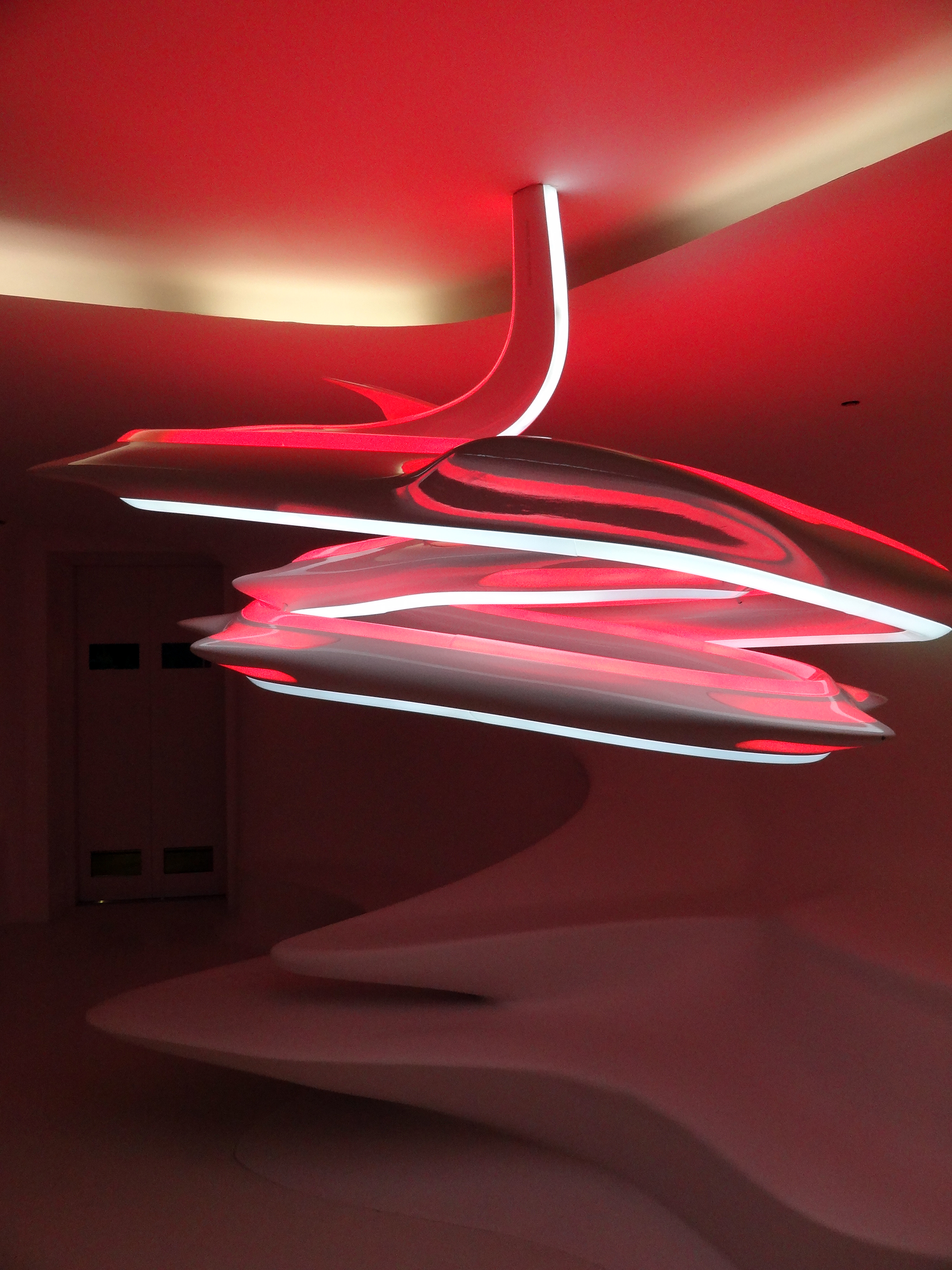
The lifts that service the property all face outwards, providing a great view of the surrounding areas of the hotel. There is also a gym and and a pool running along the other side of the sky lounge, that is again highly stylized with red, dark and moody lighting reminiscent of a sci-fi movie.
For all its star studded design credentials the bottom line is that Hotel Silken Puerta America is a highly ambitious and thoroughly original destination that has to be seen to be believed, however it is possibly not quite a true 5 star hotel. A great approach would be to visit for a unique one night stop over as you make your way closer to Madrid.
The stunningly beautiful to look at room by the late and highly celebrated Zaha Hadid is definitely awe inspiring in many respects but on balance tends to lack a little practicality. That aside, if design and architecture is your thing and you're looking for a little wow factor then you will no doubt enjoy your visit as we did.


